
Alternating Row Colors: When They Help and Hurt
By Mark Fulton · 2026-08-13 · 16 min read
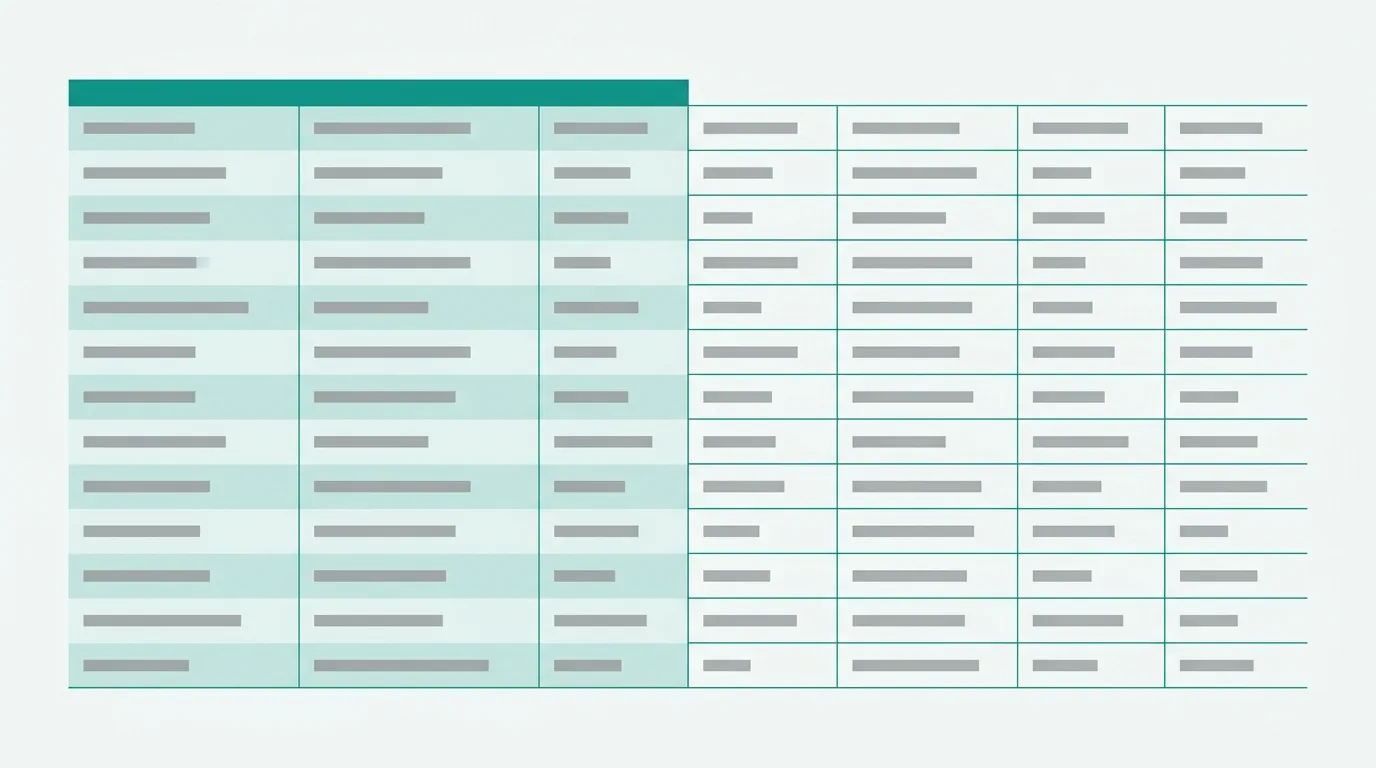
Every guide on this topic teaches you the same two clicks and the same MOD formula, and not one of them asks the question that decides the outcome: should this table be banded at all?
Alternating row colors solve one specific problem — losing your row while your eye travels across a wide table. On a table of roughly six columns or more, or any table wider than the screen, banding earns its place. On a three- or four-column table it adds texture and solves nothing. Apply it as a table style (Excel: Home → Format as Table) or as a conditional formatting rule (Home → Conditional Formatting → New Rule with =MOD(ROW(),2)=0), and in Google Sheets via Format → Alternating colors. The choice between those two methods matters more than the color, because only one of them survives a sort.
The rest of this post is the decision, the two implementations and their platform differences, the three ways banding quietly fails, and the alternative that beats it on narrow tables.
When do banded rows actually help?
Banding is a tracking aid. It exists for behaviour that happens in a reader's eye, not on the page: starting at a row label on the left, traveling right across several columns, and arriving at the correct number. On a narrow table that journey is short enough that nothing goes wrong. On a wide one, the eye drifts up or down a row somewhere in the middle, and the reader either notices and starts again or doesn't notice and quotes the wrong figure in a meeting.
So the test is width, and only width:
| Table shape | Banding? | Why |
|---|---|---|
| 2–4 columns, fits easily on screen | No | There is no tracking problem to solve. The stripes are decoration. |
| 5 columns, comfortable widths | Probably not | Borderline. If the row labels are short, skip it. |
| 6+ columns, or any table that scrolls sideways | Yes | This is the case banding was invented for. |
| Wide and already carrying conditional formatting | Careful | Two color systems competing for the same cells — see below. |
| Any width, but printing in black and white | No | A tint that reads as "barely there" on screen often prints as a visible grey stripe or vanishes entirely. |
Two things the width test quietly rules out.
Banding is not a substitute for row height. If rows are colliding because everything is jammed at the default height, stripes will make the collision easier to see rather than easier to read. Fix the spacing first.
Banding is not a fix for too many columns. If a table needs banding because it's twenty-two columns wide, banding is treating a symptom. The twenty-two columns are the problem, and the reader would be better served by a narrower table with the detail moved to a second tab.
There is one more constraint, and it applies at every width: whatever tint you choose, the text sitting on the banded row still has to be readable. The W3C's minimum contrast criterion sets 4.5:1 between text and its background for normal-size text at Level AA, relaxing to 3:1 only for text at 18 point, or 14 point bold. Spreadsheet body text is nowhere near that size, so 4.5:1 is the number. The catch specific to banding is that you now have two backgrounds — the plain row and the tinted one — and the ratio has to hold on both. A tint light enough that this is never in question is also the tint that looks best, which is convenient.
Why does banding break when you sort?
This is the question that actually sends people to forums, and the answer is short: it depends entirely on which of the three methods you used, because two of them store the color against a cell and one computes it from the row's position.
Manual fill breaks. If you selected every other row and clicked the fill bucket, the color is now a property of those specific cells. Sort the range and the cells move, and the color travels with them. What was a clean stripe pattern becomes two grey rows, then a white one, then three greys. Nothing is broken in the file; the formatting is doing exactly what you told it to. This is the single most common version of the problem, and there is no setting that fixes it — the method is wrong for a range that will ever be sorted.
Conditional formatting survives. A rule like =MOD(ROW(),2)=0 doesn't store anything on the cell. It asks, at paint time, "is this an even-numbered row?" and colors accordingly. Sort the data and the rows shuffle, but row 7 is still row 7, so it's still shaded. Microsoft's apply color to alternate rows or columns article gives exactly this formula for the purpose.
A real Excel Table survives, and does more. When you create a table object, Banded Rows is a Table Style Option rather than a fill, and Excel recalculates the banding as the table changes. Microsoft's apply shading to alternate rows or columns article notes that banding is on by default in the table styles and keeps working as you add and delete rows — which is the part the conditional formatting approach doesn't quite manage, since a MOD(ROW(),2) rule applied to A2:I50 stops at row 50 until you extend the range.
The same article documents the one-way door: converting a table back to a normal range with Table Design → Convert to Range keeps the colors you can currently see, but "color banding won't automatically continue as you add more rows or columns." At that moment your live banding becomes manual fill, with the sorting behaviour above.
Google Sheets sits closer to the table-object model. Alternating colors is applied to a range as its own formatting layer rather than as cell fills, so it holds its pattern when you sort. It comes with a limitation worth knowing before you rely on it for anything analytical: Google's tips to analyze data guide states plainly that with Data → Create a filter and the color filter, "You can filter by conditional formatting colors, but not alternating colors." If filtering by color is part of how you work, that decides your method for you.
Table style or conditional formatting — which should you use?
Here are the paths, each verified against the current vendor documentation, with the platform differences that guides tend to skip.
Excel, table style route. Select a cell in the data, then Home → Format as Table, and pick a style that has alternate row shading. Microsoft's create-and-format-tables documentation gives the same Home → Format as Table route for Excel for Mac. Excel for the web takes a slightly different path — Home → Table → Format as Table — and comes with a real restriction: you cannot customize table formatting there, so you get the style as shipped. If your work happens in the browser, plan around that rather than discovering it at the end.
Excel, conditional formatting route. Home → Conditional Formatting → New Rule (in the Styles group on the ribbon), choose "Use a formula to determine which cells to format", and enter =MOD(ROW(),2)=0. Set the fill on the Format button's Fill tab. The column equivalent, if you ever need it, is =MOD(COLUMN(),2)=0.
Google Sheets, built-in route. Format → Alternating colors opens a side panel where you set the range, pick or customize the colors, and tell it whether the range has a header and footer. The same panel carries the remove control at the bottom. One honest note on sourcing: Google does not publish a dedicated help-center article for Alternating colors the way Microsoft does for banded rows — the feature is documented mainly in passing, which is part of why third-party tutorials dominate this search result.
Google Sheets, conditional formatting route. Format → Conditional formatting, then choose "Custom formula is" from the dropdown and enter =ISEVEN(ROW()). Google's conditional formatting rules documentation covers the custom-formula mechanism and one detail that matters in the next section: "Rules are evaluated in the order listed. The first rule found to be true will define the format of the cell or range," and you reorder rules by dragging them.
Choosing between them:
| Situation | Use |
|---|---|
| Data will grow, be sorted or filtered | Table object (Excel) or Alternating colors (Sheets) |
| You need banding on a fixed block that won't change | Either; conditional formatting is fine |
| You need to band every third row, or by group | Conditional formatting — table styles only do every other row |
| You want to filter by color later, in Sheets | Conditional formatting, not Alternating colors |
| The file gets pasted into other systems | Conditional formatting on a plain range travels more predictably |
The table-vs-range trade-off in general — filter buttons, structured references, what a table style takes over — is covered in the table design rules post.
How do banded rows interact with conditional formatting?
Badly, if you don't plan for it, and the mechanism is documented rather than mysterious.
Microsoft's conditional formatting rule precedence article is direct: "If a conditional formatting rule evaluates as True, it takes precedence over any existing manual format for the same selection. This means that if they conflict, the conditional formatting applies and the manual format does not." Where two conditional rules collide, "the rule that is applied is the one that is higher in precedence (higher in the list in the dialog box)", and you manage that list via Home tab → Styles group → Conditional Formatting arrow → Manage Rules.
Mechanically, that's the outcome you want: the meaningful color wins over the structural one. The problem isn't the precedence, it's what the reader sees. Cell background is a single channel, and banding has already spent it. Once every other row carries a tint, a pale conditional highlight has to be read against two different backgrounds, and a reader who doesn't know your rules cannot tell which colors are structure and which are signal. They see a striped table with some extra stripes in it.
Three ways to keep both:
Give conditional formatting a different channel. Bold, a font color, an icon or a data bar all sit on top of banding without competing for the background. Which rule type is worth the ink is its own question, covered in conditional formatting that actually helps.
Restrict the banding to the columns that need tracking. There's no rule that says the band has to run edge to edge. Band the descriptive left-hand columns where the eye travels; leave the numeric block that carries your highlights plain.
Or drop the banding. If the table already has a working conditional rule, that rule is doing the tracking job too — a highlighted cell is an anchor your eye can navigate from. The banding is now the redundant layer, not the rule.
What's the alternative for narrow tables?
A single hairline rule between rows, or nothing at all. Here is a nine-column extract — obviously illustrative numbers, not a real dataset — shown three ways.
| Region | Rep | Product | Units | Unit Price | Revenue | Discount | Net | Close Date |
|---|---|---|---|---|---|---|---|---|
| North | A. Reyes | Starter | 120 | 49.00 | 5,880.00 | 5% | 5,586.00 | 2026-07-03 |
| North | A. Reyes | Pro | 40 | 149.00 | 5,960.00 | 0% | 5,960.00 | 2026-07-11 |
| South | J. Okafor | Starter | 310 | 49.00 | 15,190.00 | 10% | 13,671.00 | 2026-07-14 |
| South | M. Lindqvist | Pro | 25 | 149.00 | 3,725.00 | 0% | 3,725.00 | 2026-07-19 |
| East | M. Lindqvist | Enterprise | 4 | 990.00 | 3,960.00 | 15% | 3,366.00 | 2026-07-22 |
| West | D. Chukwu | Starter | 85 | 49.00 | 4,165.00 | 5% | 3,956.75 | 2026-07-28 |
Banded. Every second row carries a tint of roughly two to four percent — visible as a change, not nameable as a color. Traveling from "M. Lindqvist" in row five across to 3,366.00 is a guided trip; the stripe is a lane. What it costs: the background channel is now occupied, printing becomes a thing you have to check, and if the tint is even slightly too strong the table reads as a set of horizontal bars rather than a grid of values.
Hairline rules. No fills. A one-pixel light grey border under each row. The lane is still there — the eye follows the line — but the background stays white, so any color you add later means something. What it costs: at six or more rows the lines start to accumulate visual weight, and on a long table they can read as busier than banding. Rules also make the table look denser, which is fine for a reference sheet and wrong for a summary.
Nothing. Clean white, generous row height, numbers right-aligned so each column forms its own vertical edge. On a nine-column table this is genuinely harder to track across, and the reader will occasionally slip a row. On a four-column table it's the best of the three, because there was no problem to solve and the plain version has the highest signal-to-ink ratio in the file.
| Banded | Hairline rules | Nothing | |
|---|---|---|---|
| What the eye follows | A tinted lane | A drawn line | Alignment and whitespace |
| Costs the reader | Background channel spent; print risk | Accumulated line weight; denser look | Row slips on wide tables |
| Best at | 6+ columns, long tables | 5–8 rows, reference tables | Under 5 columns, short summaries |
| Survives sorting | Only via table style or CF | Yes — borders are per-cell, but uniform | Nothing to break |
| Fights conditional formatting | Yes | No | No |
Note the row about sorting for hairline rules. Uniform borders are the quiet advantage of the approach: because every row gets the same treatment, moving rows around cannot produce a wrong-looking pattern. There is no state to get out of sync.
One more option worth knowing on grouped data: instead of banding every other row, band by group — all the North rows tinted, all the South rows plain, all the East rows tinted. That takes a conditional formatting rule rather than a table style, and it carries actual information instead of just position. On a sorted, grouped table it's usually the better use of the same ink. Structure has to be clean for it to work, and if your sheet still has merged title bars or blank spacer rows, the messy spreadsheet checklist is the earlier step.
Let the theme make the call
If you'd rather not think about tint values, this is a decision a theme can carry. Drop a file on SuperSheet's Excel templates page and each of the five themes takes a position on banding: Minimal has no band at all, because its whole approach is one thin rule and quiet greys. Executive, Financial and Playful use a tint in the two-to-four percent range — light enough that black text keeps its contrast on both the plain and the banded row. Dark bands with a slate step against a darker canvas, which is the one case where a stronger step is correct, since the difference between two dark tones is less visible than between two light ones.
Banding also appears as its own line item in the plan the tool proposes, so you can approve everything else and switch it off. One honest limitation: the default is based on row count, not column count — banding is proposed when the sheet has more than eight rows. That's the right default for the long lists people actually format, but if your table is three columns wide, the width test in this post beats the default, and unchecking it takes one click. Precedence follows Excel's documented behaviour: a conditional rule that fires beats column styling, which beats banding, so a highlight never disappears under a stripe.
It's free, and nothing is uploaded — the file is processed in your browser. What it won't do is restructure your data: it doesn't unmerge cells or split a tab holding three stacked tables into three sheets. Guessing at somebody's structure causes more work than it saves. It formats what's there and tells you what it can't touch.
FAQ
How do I alternate row colors in Google Sheets?
Select your range, then Format → Alternating colors. A side panel opens on the right where you set the range, choose a default style or set custom header, color one, color two and footer colors, and tick whether your range has a header row and a footer row. The remove control sits at the bottom of the same panel.
Two things to know. The feature is applied to a range as its own formatting layer, so it holds its pattern when you sort — unlike a manual fill. And you cannot filter by those colors later; Google's own guidance for the color filter under Data → Create a filter states that you can filter by conditional formatting colors but not alternating colors. If color-filtering matters, build the banding with Format → Conditional formatting and a custom formula of =ISEVEN(ROW()) instead.
Why did my alternating colors disappear after sorting?
Because the color was stored on the cells rather than computed from the row. If you shaded rows by selecting them and using the fill bucket, each shaded cell owns its color, so when sorting moves that row the color rides along with it. After one sort you get clumps of two or three shaded rows and gaps of white — the pattern is gone even though nothing has failed.
The fix is to re-do the banding with a method that computes rather than stores. In Excel, either convert the range to a table with Home → Format as Table and let Banded Rows handle it, or delete the manual fills and add a conditional formatting rule with =MOD(ROW(),2)=0 via Home → Conditional Formatting → New Rule. In Google Sheets, clear the fills and use Format → Alternating colors. Clearing the old manual fills first matters; leaving them underneath produces a pattern that looks right in some rows and doubled in others.
One related trap: if you started with a table and then used Table Design → Convert to Range, Microsoft notes that the banding you can see is kept but stops updating. At that point it behaves exactly like manual fill.
What color should banded rows be?
Lighter than you think — a two-to-four percent tint of grey, or a heavily desaturated version of your accent color. The working test is that you should be able to feel the difference between two adjacent rows but struggle to name the band's color when you look at one row in isolation. If you can name it, it's too strong, and the table now reads as stripes rather than data.
The constraint underneath the taste is contrast. WCAG Level AA asks for 4.5:1 between normal-size text and its background, and with banding you have two backgrounds to satisfy. Very light tints clear that comfortably with near-black text; mid-tone fills often do not, and they fail first on a projector or a printout rather than on the monitor where you chose them.
Dark themes invert the guidance slightly. Two dark tones read as more similar than two light tones at the same numeric difference, so a dark sheet needs a slightly larger step between the base and the band to be perceptible at all — while the light text sitting on both still has to clear the same 4.5:1.
Do banded rows print well?
Sometimes, and it's worth one test page rather than an assumption. A tint chosen to be barely perceptible on a backlit screen has two failure modes on paper: on a color printer with the tint set light it can disappear completely, leaving a table you formatted for tracking with no tracking aid at all; on black-and-white output the same tint can convert to a grey that's heavier than what you saw, so the table prints as visible bars.
Both are cheap to check. Print one page — not a preview, an actual page — on the printer the document will actually go to, and look at whether the band is still a hint. If it prints too strong, lighten it; if it vanishes, that table is a candidate for hairline rules instead, which reproduce reliably in black and white because a line is a line.
Two related habits are worth pairing with the print check: turn screen gridlines off before you export, and set a print area so the banding doesn't run into empty columns. Both are covered along with freeze panes and column widths in the professional formatting rules.