
Excel Table Design: Rules That Make Tables Readable
By Mark Fulton · 2026-08-12 · 15 min read
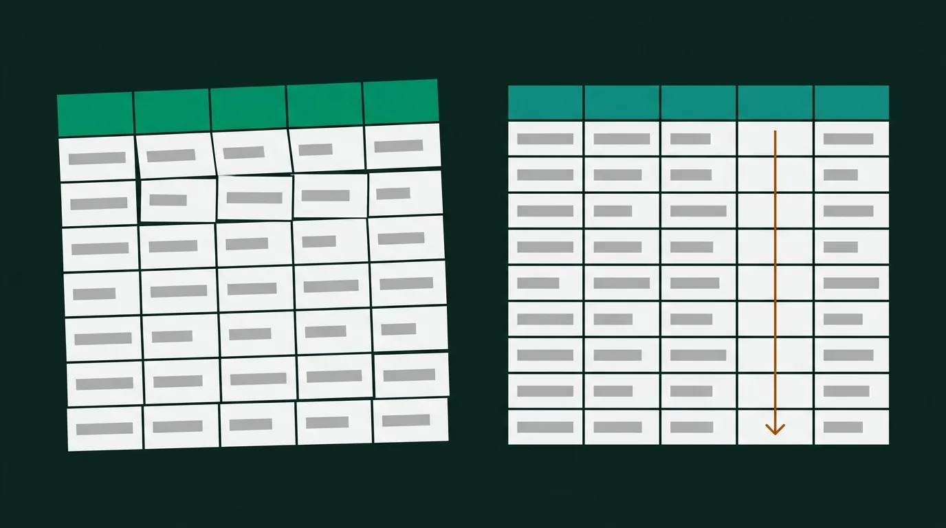
A table isn't a picture of your data. It's an instrument someone else operates, usually in about forty seconds, usually while half-listening to a call. Design rules that ignore that fact produce sheets that look tidy and still can't be read.
Excel table design comes down to seven decisions: a header row that names the unit, numbers right-aligned with a fixed decimal count, no more than three horizontal rules, one accent colour plus greys, enough padding that rows don't collide, a total that is visually separated from the data above it, and text-to-background contrast of at least 4.5:1. Each of those exists to protect a specific thing a reader does — scanning down a column, comparing two rows, or finding one number. Score your table 0–2 on each and you get a number out of 14; the rubric is at the bottom of this post.
What follows is not a list of Excel features and not a list of design platitudes. Every rule names the reading behaviour it protects first, then the action that implements it.
What does a reader actually do with a table?
Watch someone open a table you sent them. They do four things, roughly in this order, and almost nothing else:
- Read the header to work out what they're looking at and in what unit.
- Scan down one column looking for the biggest, the smallest, or the odd one out.
- Compare two rows across — this quarter against last, this region against that one.
- Find one number — usually the total, sometimes a specific cell someone mentioned.
That's the whole job. Nobody reads a table left to right, top to bottom, the way they read a paragraph. Which means every formatting choice is either helping one of those four behaviours or getting in the way of it.
Here's the mapping, and it's worth keeping in front of you while you format:
| Reader behaviour | What breaks it | The rule |
|---|---|---|
| Reading the header | Units missing, headers that wrap into three lines, headers aligned opposite to their column | Name the unit in the header; match the header's alignment to the column |
| Scanning down a column | Ragged number alignment, inconsistent decimal counts, numbers stored as text | Right-align numbers, fix the decimal count per column |
| Comparing two rows | Rows too tight to track across, a grid of vertical lines chopping the row into fragments | Horizontal separation only — banding or row padding, never a full grid |
| Finding the total | A totals row that looks exactly like the 200 rows above it | One rule above the total, bold the label, no fill |
Notice that three of the four failures are about consistency, not decoration. That's the pattern underneath most of this: readable tables are rarely more formatted than unreadable ones, they're just formatted the same way all the way down.
Why do numbers need right alignment and fixed decimals?
Because of behaviour two. When a column of numbers is right-aligned, the digit count itself becomes a rough bar chart — 1,204 is visibly shorter than 12,040, and your eye finds the order-of-magnitude outlier before you've read a single value. Left-align the same column and every number starts at the same edge, so 9 and 9,000,000 look identical for the first character, and you have to actually read all of them.
Fixed decimals do the same job at the small end. If one row shows 1,204, the next shows 1204.5, and the next 1,204.50, the decimal points don't stack, so the eye has no vertical line to travel along. Pick a decimal count per column — two for currency, zero for counts, one for rates — and apply it to the entire column at once rather than typing values differently row by row. The number formatting guide has the format codes that make that stick, including the accountant treatment for negatives.
Three refinements that most guides skip:
Mixed units break right alignment. A column that holds 4.2 km, 900 m, and 12 miles is not a quantity column, it's a label column. Right-aligning it aligns nothing, because the numbers aren't comparable. Either split the unit into its own column and normalise the values, or left-align and accept that the reader has to read each row.
Identifiers are text, not numbers. Invoice numbers, SKUs, ZIP codes, employee IDs, phone numbers — nobody sums them, nobody compares their magnitude. They're labels that happen to be made of digits, and they belong left-aligned with the rest of the labels. Excel will right-align them by default because it sees numeric values, which is exactly the case where the default is wrong.
Header alignment follows the column. A left-aligned header sitting over a right-aligned number column looks correct at exactly one column width and drifts out of true at every other. Long-standing typesetting practice allows one exception — a very short header may be centred over a right-aligned column, and below about eight characters it reads fine. Anything longer, match the column.
How many lines does a table really need?
Fewer than the grid gives you, and the answer is usually three.
Horizontal rules earn their place at structural boundaries: one under the header row, one above the totals row, and one under the last data row if the table sits inside a larger page. If your table has groups — regions containing branches, categories containing products — one thin rule under each group is a fourth legitimate use. That's the whole budget.
Vertical lines are almost never necessary, and they actively damage behaviour three. When you draw a line between every column, you chop each row into eight separate boxes, and the reader's eye has to hop each fence to track across. Alignment and whitespace already separate columns perfectly well; the vertical rule is doing a job that nothing was failing at. Keep a vertical rule only where it marks a genuine change in kind — the boundary between row labels and the numbers, or between actuals and forecast.
Gridlines are a drafting aid rather than part of the finished document and should come off before you send anything — the professional formatting rules cover that switch along with column widths and freeze panes.
Banded rows are the alternative to lines, not an addition to them. If your table is wide enough that tracking across a row is genuinely hard, a very light fill on alternate rows guides the eye across without adding a single stroke. If you turn banding on, drop the horizontal rules between data rows entirely — running both is the single most common way a table ends up looking busy. And the band has to be light. A banded row is meant to be felt, not seen; if you can name the colour without looking closely, it's too strong, and you've just introduced a contrast problem for the text sitting on it.
In a real Excel Table object, banding is a checkbox rather than a manual fill. Microsoft's table formatting documentation lists the Table Style Options group — Header Row, Total Row, First Column, Last Column, Banded Rows, Banded Columns and Filter Button — which sits on the Table Design tab in Excel for Windows and on the tab simply named Table in Excel for Mac. Excel for the web exposes the same option group, though it won't let you change the default table formatting itself. In Google Sheets the equivalent is an alternating-colours option in the Format menu rather than a tab, and it's applied to a selected range instead of a table object.
Where should totals and derived columns sit?
This is behaviour four, and it's where most tables quietly fail.
Totals go at the bottom for anything that fits on a screen or a page. That's where readers look, and it matches the visual logic of summing downward. The bottom row needs three things and no more: a label in the first column (a totals row with a blank label is a genuinely common bug), a rule above it, and bold on the number. Skip the fill — a coloured totals row competes with a coloured header row, and now the reader has two loud stripes and no hierarchy.
Totals go at the top for anything long enough to scroll. If the reader has to travel 400 rows to reach the number they opened the file for, the placement is wrong regardless of what convention says. A summary block above the header — total, count, date range — costs three rows and saves every reader the scroll. The Total Row checkbox in a real Excel Table always appends to the bottom, so a top summary is something you build manually.
Derived columns go to the right of their sources. If column D is C / B, it belongs immediately after C, not parked at the end of the table next to unrelated fields. Readers construct the calculation in their head from the adjacency; separating the ratio from its inputs forces them to look it up. The same rule puts variance next to actual and budget, and margin next to revenue and cost.
Time goes across, categories go down. Months as columns, regions as rows — not the reverse. Numbers are easier to compare down a column than across a row, so whatever you most want compared should run vertically. If your table has ten regions and four quarters, regions are the rows.
One structural rule underneath all of this: one table per sheet. Two tables stacked on the same tab with a blank row between them will break sorting, filtering and any table object you try to create, and it's the layout that causes the most trouble downstream. Splitting them costs a minute.
How much colour is too much?
Count the distinct colours in your table. Not shades — distinct colour decisions. If the answer is more than three, including your header fill, you've spent colour on things that aren't important, which means nothing on the sheet reads as important.
The working budget is one accent plus greys, with a single warning tone held in reserve for genuine exceptions. That budget is covered in more depth in the professional formatting rules; the part worth adding here is the accessibility floor underneath it, which no Excel table design article on the first page of Google currently covers.
Contrast has a number, and it isn't a matter of taste. The W3C's minimum contrast guidance sets 4.5:1 between text and its background for normal text at Level AA, relaxing to 3:1 for large text — defined as at least 18 point, or 14 point bold. Spreadsheet body text is nowhere near 18 point, so the number you're working to is 4.5:1. This is where the popular "dark header fill with white text" advice quietly breaks: a mid-tone blue or a medium grey fill can land under 4.5:1 against white text while looking perfectly fine on your monitor, and it'll be the first thing that fails on a projector or a printout.
Colour cannot be the only carrier of meaning. Microsoft's Excel accessibility guidance is direct about this: a reader with a vision disability may miss whatever a particular colour was meant to convey, so the recommendation is to pair colour with a second signal. In practice that means a red cell also carries a minus sign or a parenthesis, a flagged row also carries a word in a status column, and a highlighted column also carries a bold header. The colour becomes the fast path, not the only path.
Microsoft's own accessibility checker will flag insufficient contrast for you — Review → Check Accessibility, which is the same path in Excel for Windows, Excel for Mac and Excel for the web. The same guidance is worth reading for two structural points it makes that bear directly on table layout: screen readers use header information to identify rows and columns, and they track position by counting cells, so merged cells and blank rows make a table hard to navigate for anyone not reading it visually. That's a good reason to avoid merges beyond the aesthetic one.
Data bars, colour scales and icon sets are a separate question with their own trade-offs — when conditional formatting actually helps covers which rule type is worth the ink.
How do you score your own table before sending it?
Open the file you're about to send and score it against these seven criteria. Each is worth 0, 1 or 2. Maximum 14.
| # | Criterion | 0 points | 1 point | 2 points |
|---|---|---|---|---|
| 1 | Header clarity | Headers missing, cryptic, or buried below row 1 | Headers present and readable, but units unstated | Every header names what it is and its unit, fits on one or two lines, aligned with its column |
| 2 | Number alignment | Numbers left-aligned or mixed; some stored as text | Right-aligned, but identifiers right-aligned too | Quantities right-aligned, labels and IDs left-aligned, headers matched |
| 3 | Decimal consistency | Multiple decimal counts inside one column | Consistent per column, but decimal count hides real differences (0% on rates) |
One decimal count per column, chosen so the differences that matter are visible |
| 4 | Line economy | Full gridlines on, or borders around every cell | Some structure, but vertical rules between most columns | Three or four horizontal rules total, vertical rules only at a real boundary |
| 5 | Colour count | Four or more distinct colours, or a full-table heat map | Two or three, but contrast under 4.5:1 somewhere | One accent plus greys, one reserved warning tone, all text at 4.5:1 or better, colour never the only signal |
| 6 | Whitespace | Columns truncating text or showing #####; rows collided |
Widths fit, but a description column sprawls past the screen | Every column fits its content, one outlier column capped and wrapped, consistent row height |
| 7 | Total visibility | No total, or a total identical to the data rows | Total present and bold, but unlabelled or buried below a long scroll | Labelled, one rule above it, reachable without hunting — top of sheet if the table is long |
Pass mark: 11 out of 14, with no zeros. The no-zeros condition matters more than the total. A table scoring 12 with a zero in alignment is worse to read than one scoring 11 flat, because a single broken column stops the scan behaviour entirely while a mediocre-but-consistent table just looks plain. Fix every zero first, then chase points.
Two honest limits on the rubric. It says nothing about whether your numbers are right — a beautifully formatted wrong total is still a wrong total. And it assumes the data is already in one clean rectangle: one table per tab, one header row, no merged title bars, no blank spacer rows. If that isn't true yet, the rubric will just tell you things you can't act on, and the messy spreadsheet checklist is the earlier step.
Score your table, then compare
Run the rubric on a file you actually have to send this week. Then drop the same file on SuperSheet's Excel formatter and score the output the same way. It reads your columns, proposes number formats, a totals row, freeze panes and a theme, and you approve or reject each piece before anything is written. It's free, and nothing is uploaded — the file is processed in your browser.
One thing it deliberately does not do: it won't unmerge your cells or split a tab holding three stacked tables into three sheets. Restructuring somebody's data means guessing what they meant, and a tool that guesses wrong about structure causes more work than it saves. It formats what's there and tells you what it can't touch. Criteria 1 through 7 in the rubric above are what it can help with; the "one clean rectangle" precondition is still yours.
FAQ
Should I use Excel's built-in table styles?
For most business tables, yes — with edits. Creating a real table via Home → Format as Table (the same path in Excel for Windows and Excel for Mac, per Microsoft's create and format tables documentation) gets you a header row, filter buttons and a structured range in one action, which is faster than styling by hand and harder to get inconsistent.
The edit worth making is turning things off. The default styles ship with banded rows plus a saturated header fill plus a filter button on every column, and on a five-column summary table that's three signals where you need one. Uncheck what you don't need in the Table Style Options group. Note that Excel for the web won't let you change the default table formatting itself, so if you're building there, plan on the style you get.
The other consideration is timing: table styles and manual cell formatting interact awkwardly, so decide which route you're taking before you start rather than halfway through.
How many colors should a spreadsheet table have?
One accent plus greys, with a single warning tone reserved for genuine exceptions — so three colour decisions maximum on a typical table, and often two. This isn't an arbitrary limit. Colour works by contrast against its surroundings, so each additional colour reduces what the others can signal. A table where the header is blue, the totals are green, three cells are yellow and a column is shaded grey has four things claiming to be important, which reads as none.
Whatever you pick has to clear 4.5:1 contrast against the text sitting on it for normal-sized text, per WCAG Level AA. That constraint eliminates a lot of mid-tone fills with white text that look fine on a good monitor.
Do banded rows help or hurt readability?
It depends on the width of the table, which is why the advice you find online contradicts itself so reliably.
Banding helps when the table is wide enough that a reader can lose their row while tracking across — roughly six or more columns, or any table wider than the screen. It replaces horizontal rules and does the same job with less visual weight.
Banding hurts on narrow tables, where there was no tracking problem to solve and the stripes just add texture. It also hurts when the band is too dark, when it's combined with horizontal rules (pick one), or when it's fighting conditional formatting for the same cells — at which point the reader can't tell which colours are structural and which mean something.
Default to no banding under six columns, banding above it, and always at the lightest tint that's still perceptible.
What's the difference between a formatted range and a real Excel Table?
A formatted range is cells you've styled by hand: fills, borders, alignment, number formats. It looks like a table and Excel treats it as ordinary cells.
A real Excel Table is an object you create with Home → Format as Table (or Ctrl+T). Excel then knows where the table starts and ends, which gives you things a formatted range can't have: filter buttons, a Total Row checkbox that inserts SUBTOTAL functions, a name you can reference in formulas instead of cell addresses, formats and formulas that extend automatically when you add a row, and header information that screen readers use to identify rows and columns.
The trade-off is control. Table styles want to own the look of the range, so heavy manual formatting on top of a table style can produce results you didn't expect, and some workflows — pasting into other systems, certain add-ins — deal with plain ranges more predictably.
Practical rule: if the data will grow, be filtered, or be referenced in formulas, make it a real table. If it's a static summary block you're formatting once and sending, a formatted range is fine and simpler.