
Excel Dashboard Design: One Screen, Five Numbers
By Mark Fulton · 2026-08-24 · 16 min read
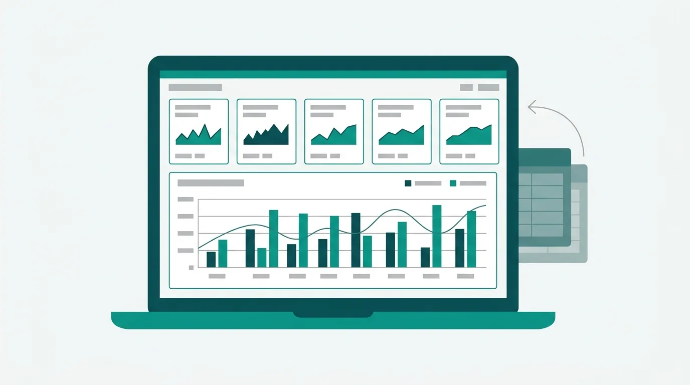
Treat an Excel dashboard as a layout problem with a fixed budget, not a data problem. The budget is: one screen with no scrolling, five numbers, one comparison for each number, at most two charts, and three tabs that never mix roles (raw data, calculations, presentation). Everything that does not fit inside that budget goes on a detail tab and gets linked to, not squeezed in. Build the wireframe first, in empty cells, before a single chart exists. The reason dashboards fail is almost never that Excel could not do it. It is that nobody decided what the reader was allowed to look at.
Dashboard advice is mostly written by companies that sell business intelligence tools, which is why so much of it arrives at the same conclusion: this is hard in Excel, have you considered our product. The technique advice inside those articles is often fine. The framing is not, because the framing assumes your problem is capability. Your problem is editing. You have forty columns and a manager who will look at your file for about ninety seconds, on a laptop, probably in a hotel lobby, possibly as a PDF attached to an email. That is a design constraint, and Excel handles it perfectly well.
This is the version that stays inside Excel and treats the whole thing as layout.
What is a dashboard supposed to replace?
A dashboard is not a summary of your data. It is a replacement for a conversation.
That distinction decides everything else. If somebody built a dashboard because they were tired of being asked "how did we do last month", then the dashboard has exactly one job: answer that question before it gets asked, so completely that the follow-up question is about a decision rather than a number. If it answers halfway, it has not saved anyone anything. The manager still sends the email, and now you maintain a file as well.
So before you open Excel, write down the sentence the dashboard replaces. Real examples:
- "Are we going to hit the quarter, and which region is dragging?"
- "What did we spend, against what we budgeted, and what is the one line item that moved?"
- "How many tickets came in, how many closed, and is the backlog growing or shrinking?"
Each of those sentences contains three to five nouns. Those nouns are your numbers. If your sentence contains twelve nouns, you do not have a dashboard, you have a report, and a report is a legitimate thing to build instead. Reports scroll. Dashboards do not.
The second half of that sentence is usually a comparison, and people skip it. "What did we spend" is not a number anyone can act on. "What did we spend against budget" is. Every number on the dashboard needs a partner number, or it is decoration.
Why does one screen mean one screen?
Because the moment a reader scrolls, they start comparing from memory, and memory is bad at numbers.
The whole value of putting five figures next to each other is that the eye can move between them without the brain having to hold anything. Push the fifth number below the fold and it stops being part of the comparison. It becomes an appendix. Readers treat the top of a dashboard as the dashboard and the rest as backup, whether you intended that hierarchy or not, so you may as well choose the hierarchy deliberately.
One screen also means one screen on their machine, not yours. Two practical rules follow:
Design to a smaller viewport than you have. If you build on a 27 inch monitor at 100 percent zoom, your dashboard is a page and a half on a 13 inch laptop. Shrink your own Excel window to roughly laptop proportions and design inside that. It is a crude test and it works.
Do not let zoom be the fix. Setting the tab to 70 percent zoom so everything fits is not a solution, it is a way of making your type unreadable and pretending the layout succeeded. If it only fits at 70 percent, cut something.
The dashboard tab should not need frozen panes at all, because there is nothing to scroll past. The data tab absolutely does, and that is what Microsoft's freeze panes documentation is for. The current path there is View > Freeze Panes > Freeze Panes, and the article covers Microsoft 365, 2024, 2021, 2019 and 2016 without listing a separate Mac path; the View tab carries the same control in Excel for Mac and in Excel for the web. If you find yourself reaching for freeze panes on the dashboard tab, that is the clearest possible signal that the dashboard has outgrown its screen.
The wireframe
Build this in empty cells before you build anything real. Type the labels, leave the numbers as zero, and look at it. Layout mistakes are obvious in a wireframe and invisible once there are charts to admire.
   A    B    C    D    E    F    G    H    I    J    K    L    M    N    O    P
 1 .  ┌──────────────────────────────────────────────────────────────────┐  .
 2 .  │  TITLE:  Q3 Regional Performance                                 │  .
 3 .  │  Data through 22 Aug 2026  ·  Source: Data tab  ·  Owner: M.F.   │  .
 4 .  └──────────────────────────────────────────────────────────────────┘  .
 5 .  ┌─────────┐  ┌─────────┐  ┌─────────┐  ┌─────────┐  ┌─────────┐     .
 6 .  │ REVENUE │  │ MARGIN  │  │ NEW ACC │  │ CHURN   │  │ PIPELINE│     .
 7 .  │  $1.24M │  │  38.1%  │  │    47   │  │   2.9%  │  │  $3.8M  │     .
 8 .  │ +6% MoM │  │ -1.2pp  │  │ +12 MoM │  │ +0.4pp  │  │ 1.9x cov│     .
 9 .  └─────────┘  └─────────┘  └─────────┘  └─────────┘  └─────────┘     .
10 .                                                                        .
11 .  ┌───────────────────────────────┐  ┌───────────────────────────────┐  .
12 .  │ CHART 1                       │  │ CHART 2                       │  .
13 .  │ Revenue by month, 13 months   │  │ Revenue by region vs quota    │  .
14 .  │ (line, one series)            │  │ (bar, sorted descending)      │  .
   .  │                               │  │                               │  .
22 .  └───────────────────────────────┘  └───────────────────────────────┘  .
23 .                                                                        .
24 .  ┌──────────────────────────────────────────────────────────────────┐  .
25 .  │ WHAT CHANGED (3 lines, plain sentences, written by a human)       │  .
26 .  └──────────────────────────────────────────────────────────────────┘  .
27 .  Footnote: refreshed 22 Aug · next refresh 29 Aug · detail on Data tab .
| Region | Cell range | Content | Rule it enforces |
|---|---|---|---|
| Left gutter | Column A, width 2 | Empty | Nothing starts hard against the edge |
| Title band | B2:O2 | Dashboard name, 16pt | One title, no subtitle stack |
| Provenance line | B3:O3 | Date through, source tab, owner | The reader can date the file without asking |
| KPI tile 1 | B5:C9 | Label, number, comparison | Three rows per tile, never four |
| KPI tile 2 | E5:F9 | Same shape as tile 1 | Identical geometry across all five |
| KPI tile 3 | H5:I9 | Same shape | |
| KPI tile 4 | K5:L9 | Same shape | |
| KPI tile 5 | N5:O9 | Same shape | |
| Gutters | D, G, J, M, P (width 2) | Empty | Separation without borders |
| Chart 1 | B11:I22 | Trend over time, one series | Time on the left, always |
| Chart 2 | K11:O22 | Comparison across categories, sorted | Category on the right, always |
| Narrative block | B24:O26 | Three plain sentences | The part a chart cannot say |
| Footnote | B27:O27 | Refresh dates, where detail lives | Kills the "is this current?" email |
| Everything else | Row 28 down, column Q right | Nothing, ever | The screen boundary is real |
Two notes on making that grid behave. Use narrow empty columns as gutters rather than borders on everything; whitespace separates more cleanly than lines, and it survives being resized. And for the title band, use Center Across Selection from the alignment dialog rather than merging cells, for the reasons in our piece on the merged cell alternative. Merged cells on a dashboard tab are usually harmless, merged cells anywhere near data are not, and it is easier to have one habit than two.
How do you pick the five numbers?
Five is arbitrary in the same way that a word limit is arbitrary. It is not the right number because of any property of human cognition. It is the right number because it is small enough to force an argument about the sixth.
Run the selection like this.
Write down every number a reader might want. Usually twelve to twenty. Do this fast and uncritically.
Cross out every number that is an input rather than an outcome. Headcount, number of rows, units in stock: these are things you feed into a decision, not things a decision is made about. They belong on the detail tab.
Cross out every number that moves only when another number moves. If revenue and units always march together, you are spending two tiles to say one thing. Keep the one that gets asked about.
Cross out every number nobody has ever acted on. Ask honestly. Most dashboards carry at least one metric that exists because somebody senior mentioned it once in 2023.
Rank what is left and take five. If you cannot get below seven, the honest read is usually that you are serving two audiences, and two audiences want two dashboards.
Then give each survivor a comparison. A number with no comparison is a number the reader has to price themselves, and they will not. The comparison can be prior period, budget or target, same period last year, or a threshold, and the correct choice is whichever one the reader would have asked for. Show it as a delta next to the figure, not as a second full-size number, because the delta is the thing being read.
Scale the units so the tile reads at a glance: 1.24M, not 1,238,417. That is a number format, not a rounded value, and getting the format code right is its own subject, covered in the Excel number formatting guide. Never retype the rounded value into the tile. The formula stays live, the display gets shortened.
Colour on the tiles: use it for direction, and only for direction, and never as the only carrier of the meaning. A red delta should also carry a minus sign or a down arrow, which is the same principle Microsoft's accessibility guidance for Excel applies to colour-coded links, and the reason it recommends you run Review > Check Accessibility before you send. Contrast matters more than usual on a dashboard because the type is doing so little work: WCAG's minimum contrast criterion asks for 4.5:1 on normal text and 3:1 on large text, where large means at least 18pt or 14pt bold. Your 20pt tile numbers get the easier 3:1. Your 9pt tile labels and your delta text do not, and those are exactly the elements people set in light grey.
For the charts, and only the charts, conditional formatting is usually the wrong tool. On a dense data tab it is the right tool, and which flavour to reach for is covered in conditional formatting that actually helps. On a five-tile dashboard, a colour scale across five unrelated metrics is just noise with a gradient.
How should the data, calculation and presentation tabs be separated?
Three tabs, three roles, and the roles never blend:
Data. Raw records, one header row, one row per record, no blank rows, no subtotals, no formatting that means anything. This tab is allowed to be ugly. It is not allowed to be clever. Ideally it is pasted or refreshed wholesale, so that updating means replacing the contents rather than editing in place.
Calculations. Every formula, PivotTable, lookup and intermediate step. This is the tab nobody sees and everybody needs. Name the cells that feed the dashboard, so the dashboard reads =Calc_Revenue_Current rather than =Calc!D47, and next quarter's you does not have to reverse engineer a cell reference.
Dashboard. Presentation only. Every cell here either displays a value computed elsewhere, or is empty, or is a label. No cell on this tab should contain a formula that does arithmetic on raw data.
The reason for the middle tab is that it absorbs change. When the data grows by three columns, the calculation tab is where you fix it, and the dashboard does not move a pixel. When you skip it and let the dashboard reach directly into the data, every structural change to the source breaks your layout, and you end up rebuilding the presentation to accommodate a plumbing problem.
Name the tabs plainly (Data, Calc, Dashboard), because screen readers announce sheet names and because you will open this file in four months. Put the dashboard tab first and save the file with that tab selected, so it opens where the reader should start. That last trick, and the case for a summary tab in general, is the whole subject of how to present a spreadsheet to executives.
Which Excel elements survive being emailed, and which don't?
This is the part that gets skipped, and it is the part that decides whether anyone actually sees your work. A meaningful share of dashboard viewing happens as a PDF on a phone, because that is what the recipient forwards to their boss.
What survives cleanly: cell values, number formats, fills, borders, fonts, charts, and conditional formatting results. What breaks: anything interactive, and anything positioned by luck.
- Slicers, filters and form controls do nothing in a PDF. They render as static rectangles showing whatever was selected when the file was exported. If your dashboard's story depends on the reader clicking a slicer, the PDF version of that dashboard is a different, worse document. Build the default view to be the useful one.
- Floating objects drift. Charts, shapes and text boxes anchored loosely will move when the file opens at a different zoom or on a different machine. Set each chart's properties to move and size with cells so it stays inside its wireframe region.
- Column widths decide your page breaks. A dashboard that is 16 narrow columns wide fits landscape; one that has quietly grown to 22 does not, and Excel will cut it in a place you did not choose.
- Your one screen is not automatically one page. Set the print area explicitly. Per Microsoft's print area documentation, the path is Page Layout tab > Page Setup group > Print Area > Set Print Area, and the article notes that a worksheet can hold multiple print areas, each printing as a separate page, and that clearing one clears them all. That path is the same in Excel for Mac. Excel for the web carries a thinner Page Layout tab, so do page setup in the desktop app and let the file carry the settings.
Set the print area to exactly your wireframe rectangle (A1:P27 in the example above) and the PDF stops being a surprise. The full pre-export pass is in Excel to PDF without losing formatting, and if the detail tabs need to go out on paper too, printing on one page covers the scaling trap.
How do you keep it maintainable next month?
The failure mode is not that the dashboard breaks loudly. It is that it keeps working while quietly going wrong, because a range stopped covering the new rows and the total is now short by a fortnight.
Four habits prevent almost all of it.
Make the data tab a real Excel Table. Formulas and PivotTables that point at a Table expand with it automatically. Formulas that point at A2:A500 do not, and the day your data reaches row 501 nothing turns red.
Put a row count on the dashboard. Not as a KPI tile, as a footnote: "1,204 records through 22 Aug". Anyone who knows the business will notice when that number stops moving.
Write the refresh instruction into the file. One cell on the Calc tab, plain sentence: "Paste the export from the CRM over Data!A1, keeping headers. Nothing else needs touching." The person doing this in November may not be you.
Change the layout on purpose or not at all. New metric arriving means an existing metric leaves, or the wireframe gets redrawn deliberately. Six tiles squeezed into a five-tile grid is how a clean dashboard becomes a cluttered one, one reasonable exception at a time.
Frequently asked questions
How many charts belong on an Excel dashboard?
Two, in most cases, and rarely more than three. One showing change over time and one showing a comparison across categories will answer the large majority of questions a dashboard is built for. A third is defensible when it answers a genuinely different question. Beyond that, charts stop being read individually and start being read as texture, which is the point at which they are decoration. If you find yourself needing five charts, what you actually need is a detail tab with five charts and a dashboard that links to it.
Should a dashboard live in the same file as the data?
Yes, if the data is small enough to travel (roughly, if the file stays comfortably emailable), because a self-contained file always opens correctly and never has a broken link. Split into separate files only when the data is genuinely large, when several people need to edit the source at once, or when the source is refreshed by a process you do not control. If you do split, keep the calculation layer with the dashboard rather than with the data, so the presentation file remains repairable on its own.
Do I need pivot tables to build one?
No. PivotTables are the fastest way to get from a long data tab to the handful of aggregates a dashboard needs, and most guides teach them for that reason. But SUMIFS, COUNTIFS and AVERAGEIFS on the calculation tab produce identical numbers, refresh without anyone remembering to refresh them, and are easier to audit six months later because the criteria are visible in the formula. Use PivotTables when you are exploring. Consider plain formulas when you are shipping something that has to survive being handed over.
How do I stop a dashboard breaking when the data grows?
Format the data tab as an Excel Table and reference the Table, not fixed cell ranges. Route everything through the calculation tab so the dashboard never touches raw data directly. Name the cells the dashboard reads. Then add a visible record count to the dashboard footnote so a silent failure becomes a visible one. Those four things together handle new rows automatically and make new columns a five minute fix on one tab rather than a rebuild.
Start with the data tab, not the dashboard
Here is the thing that makes the layout above easy to build: a clean, well formatted source table makes the dashboard obvious. When the data tab has a single header row, consistent number formats, real numeric types instead of text that looks numeric, and columns wide enough to read, the five numbers worth putting on a dashboard tend to announce themselves. When it is a mess, you spend the first hour arguing with the data and design the dashboard in the last five minutes.
SuperSheet does that first part. Drop an .xlsx or .csv on the page, and it reads the sheet in your browser (the file is parsed and the formatted copy is generated locally, not uploaded and stored), shows you a plan you can toggle item by item, and hands back a real Excel file with proper number formats, a live totals row that is a formula rather than a pasted value, a frozen header row, gridlines off and one of five themes applied. There are theme previews at /excel-templates if you want to see the Executive and Financial ones before you try it.
It is worth being clear about what it does not do, because tools in this category tend to guess. SuperSheet formats one table per tab. It does not unmerge merged cells, and it does not restructure a tab that contains several stacked tables into something tidier; it will read the first table it finds and leave the rest alone. If your source is a hand built layout with merged headers and three tables on one sheet, sort that out first (the messy spreadsheet checklist is the short version), then run it through.
Format the data tab first. Then build the wireframe. The dashboard is the easy part once the source stops fighting you.