
How to Format a Budget Spreadsheet People Read
By Mark Fulton · 2026-08-25 · 14 min read
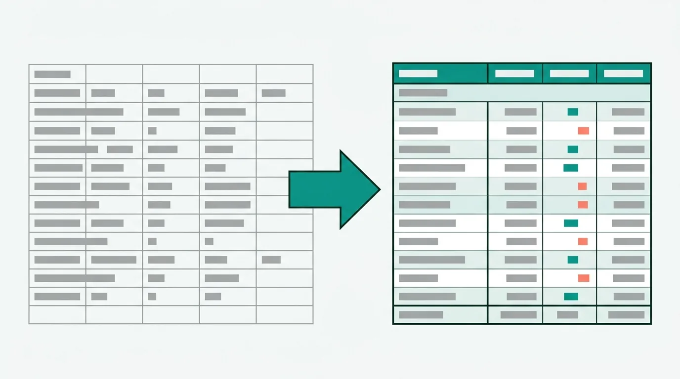
Format a budget so a reviewer can answer one question fast: did we spend what we said we would? That means five columns (Category, Plan, Actual, Over/(Under), % of Plan), currency shown once in the header instead of on every cell, variances in a format code that shows over-budget in red and under-budget in green parentheses, subtotal rows separated by a single rule with a double rule under the grand total, and exactly one conditional formatting rule flagging rows more than 10% over plan. The numbers you already have are fine. The layout is what makes them reviewable.
Search for this and you get template galleries. A gallery hands you someone else's categories, someone else's assumptions about whether "Utilities" includes internet, and a colour scheme you now have to live inside. Most people arrive with a sheet that already has their real numbers in it. The problem is not the numbers. The problem is that the sheet is a two-column list with a SUM at the bottom, and nobody, including its author next month, can tell at a glance whether it is going well.
This is how to fix that sheet. It works the same for a household budget and a small-business one, because the reading behaviour is identical.
What should a budget's columns be?
Three columns is the minimum that says anything: Category, Plan, Actual. A two-column budget (Category, Amount) is not a budget, it is a list of intentions, and it cannot be reviewed at all because there is nothing to compare against.
Add two more and the sheet starts answering questions on its own:
| Column | Header | What goes in it |
|---|---|---|
| A | Category | Text, left aligned, one level of indent under a section header |
| B | Plan | The number you committed to |
| C | Actual | What happened |
| D | Over/(Under) | =C4-B4 |
| E | % of Plan | =IFERROR(D4/B4,"") |
Two decisions inside that are worth arguing about.
Variance is Actual minus Plan, not the other way round. That makes a positive number mean "spent more than planned", which matches how the phrase "we're over" is used out loud. The column header carries the sign convention: Over/(Under). Half of the confusion in shared budgets is two people using opposite conventions and neither writing it down.
The percent column divides by Plan, not by the total. "Groceries are 16% over" is actionable. "Groceries are 23% of spending" is trivia you can get from the numbers already on screen. Wrap it in IFERROR because a zero in the Plan column is common in the first month and #DIV/0! down a column looks like the sheet is broken.
Put the currency symbol in the header text (Plan ($)) and use #,##0 in the body cells. A twelve-row budget with a dollar sign on every figure has thirty-odd repeated glyphs competing with the digits you actually want to compare. The exception is the grand-total row, where $#,##0 earns its place because that figure gets read on its own.
How should negatives and variances be displayed?
A minus sign is one pixel wide at 11pt and it is the single most important character in the column. Parentheses and colour together are the fix, and they need to be a number format rather than manually applied red font, because manual colour does not update when the number changes.
For the expense variance cells, this code:
[Red]#,##0;[Green](#,##0);"-"
Positive (over budget) prints in red. Negative (under budget) prints in green inside parentheses. Zero prints as a hyphen instead of a distracting 0. A format code can carry up to four sections separated by semicolons, and the colour name in square brackets has to be the first item in its section, per Microsoft's guidelines for customizing a number format. Google Sheets accepts the same eight bracketed colour names and the same four-part structure, documented in Google's number formatting help; the menu path there is Format → Number → Custom number format. In Excel it is Ctrl+1 (⌘+1 on Mac) → Number → Custom, or on the web Home → Number Format → More Number Formats.
Note that the parentheses do the work on their own for anyone who cannot distinguish red from green. Colour is the accelerant, not the signal. If you strip the colour out of this sheet it still reads correctly, which is the test worth applying to any colour decision in a spreadsheet.
Do not apply the red/green code to the income rows. On an income line, actual above plan is good news, and the same format would print it in red. Format income variance with a plain signed code instead:
+#,##0;-#,##0;"-"
and let the section header make clear which block you are in. This is the detail that separates a budget somebody built from a template somebody downloaded. The template cannot know which rows invert.
The percent column takes 0.0%;(0.0%);"-". The syntax underneath all of these, and why # and 0 behave differently, is covered properly in the Excel number formatting guide. You do not need it to type the four codes above.
Which rows are subtotals, and how do you make that obvious?
Every budget has three kinds of row and they should look like three different things:
- Section headers (INCOME, FIXED COSTS, VARIABLE) are bold, unindented, and hold no numbers.
- Line items are indented one level in column A, plain weight.
- Subtotals are bold with a single top border, sitting immediately under the lines they sum.
- The grand total is bold with a top border and a double bottom border.
That single-rule-above, double-rule-below convention is not decoration. It is how printed financial statements have signalled "this figure is derived from the rows above" for a century, and readers parse it without being taught. Borders live in Home → Font group → Borders in Excel and Format → Borders in Sheets.
The mechanical part is the formula. Use SUBTOTAL rather than SUM for every subtotal and for the grand total:
B13:  =SUBTOTAL(109,B10:B12)     Total fixed costs
B19:  =SUBTOTAL(109,B16:B18)     Total variable costs
B21:  =SUBTOTAL(109,B10:B19)     Total expenses
B21 spans a range that already contains two subtotal rows, and it does not double-count them, because SUBTOTAL ignores nested subtotals inside its own reference. Write that grand total as =SUM(B10:B19) and you get exactly twice the right answer, which is the classic budget bug: everything looks plausible, every category is right, and the bottom line is wrong by a factor of two. The 109 variant sums the SUM operation while excluding rows you have manually hidden; 9 includes them. Both ignore rows removed by a filter.
The worked example: twelve rows, before and after
Here is the same household budget in both states. Same values, same formulas underneath, nothing recalculated.
Before. Column A holds categories, column B holds "what I spent", the format is General, and there is a =SUM(B2:B9) at the bottom.
| A | B | |
|---|---|---|
| 2 | Salary | 6200 |
| 3 | Side income | 615 |
| 4 | Rent | 1850 |
| 5 | Utilities | 288 |
| 6 | Groceries | 812 |
| 7 | Transport | 154 |
| 8 | Eating out | 233 |
| 9 | Insurance | 165 |
| 10 | Total | 10317 |
That total is meaningless (it adds income to expenses), the sheet has no plan to compare against, and nothing about it tells you that eating out ran away this month. It is also, roughly, what the how-to-budget-in-Excel results teach you to build.
After. Five columns, three sections, three subtotals.
| Row | A Category | B Plan ($) | C Actual ($) | D Over/(Under) | E % of Plan |
|---|---|---|---|---|---|
| 3 | Category | Plan ($) | Actual ($) | Over/(Under) | % of Plan |
| 4 | INCOME | ||||
| 5 | Salary | 6,200 | 6,200 | - | - |
| 6 | Side income | 400 | 615 | +215 | 53.8% |
| 7 | Total income | 6,600 | 6,815 | +215 | 3.3% |
| 9 | FIXED COSTS | ||||
| 10 | Rent | 1,850 | 1,850 | - | - |
| 11 | Utilities | 240 | 288 | 48 | 20.0% |
| 12 | Insurance | 165 | 165 | - | - |
| 13 | Total fixed | 2,255 | 2,303 | 48 | 2.1% |
| 15 | VARIABLE | ||||
| 16 | Groceries | 700 | 812 | 112 | 16.0% |
| 17 | Transport | 180 | 154 | (26) | (14.4%) |
| 18 | Eating out | 150 | 233 | 83 | 55.3% |
| 19 | Total variable | 1,030 | 1,199 | 169 | 16.4% |
| 21 | Total expenses | 3,285 | 3,502 | 217 | 6.6% |
| 22 | Left over | 3,315 | 3,313 | (2) |
Rows 8, 14 and 20 are deliberately empty. They are the cheapest formatting available and they do more for scanning than any border.
The treatment applied to each region, in full:
| Range | Format code | Other treatment |
|---|---|---|
| A3:E3 | text | Bold, bottom border, wrap text on |
| A4, A9, A15 | text | Bold, no fill, no indent |
| A5:A6, A10:A12, A16:A18 | text | Indent 1 (Home → Alignment → Increase Indent) |
| B5:C19 | #,##0 |
Right aligned by default, leave it |
| B21:C22 | $#,##0 |
Bold, top border; double bottom border on row 22 |
| D5:D7 | +#,##0;-#,##0;"-" |
Income block, no red/green |
| D10:D22 | [Red]#,##0;[Green](#,##0);"-" |
Expense block |
| E5:E22 | 0.0%;(0.0%);"-" |
|
| A7, A13, A19, A21, A22 | text | Bold, top border |
Notice what the after version says that the before version cannot. Total expenses came in 6.6% over plan, which nobody would call a bad month. Eating out came in 55.3% over. The row-level percent is the whole reason to build the fifth column: aggregates hide exactly the thing you would act on.
Which single conditional rule is worth adding?
One. Flag expense rows that ran more than 10% over plan.
Apply it to the line-item cells only, not the subtotal rows. Those already carry bold and a border, and a subtotal that flags red tells you nothing you cannot read from the lines above it. In Excel, select E10:E12, hold Ctrl and add E16:E18, then Home → Conditional Formatting → New Rule → Use a formula to determine which cells to format, and enter:
=AND($B10<>0,$C10>$B10*1.1)
Set the format to a light red fill, no font change. In Google Sheets it is Format → Conditional formatting → Custom formula is, same formula, same range.
The $B10 / $C10 mix matters: dollar-locked column, relative row, so the rule evaluates per row. The $B10<>0 guard stops rows with no plan from flagging. Against the sheet above, the rule lights up Utilities, Groceries and Eating out, and leaves Transport, Rent and Insurance alone.
Resist adding a second and a third. A budget with four conditional rules is a budget where nothing stands out, which is the same as having none. If you are choosing between data bars, colour scales and a rule like this one, the trade-offs are laid out in conditional formatting that actually helps.
Where does formatting stop and analysis start?
Formatting can make a number legible, findable, and correctly signed. It cannot tell you that three of the groceries transactions were actually a dinner party, or that the insurance line is annual and you have been treating it as monthly. Those are category problems, and the sheet will present them beautifully while being wrong.
The practical split: format first, because a legible sheet is the cheapest way to spot a category error, and you will spot two or three the moment the variance column exists. Then fix the categories. Then look at the format again, because fixing categories usually adds a row.
What breaks when you add a month?
Two things, reliably.
Ranges that end at the last row. =SUM(B10:B19) does not extend when you type a new expense into row 20. Insert the new row inside the range (right-click row 18 → Insert) and the formula grows to B10:B20 on its own. Append below it and it silently does not. If you would rather not think about this, select the block and press Ctrl+T to make it a real Excel table, then use Table Design → Total Row, which recalculates over the whole column as it grows and writes SUBTOTAL for you. The difference between a formatted range and an actual table is worth understanding before you commit; it is covered in Excel table design best practices.
Layout drift. The natural instinct is to copy the tab and rename it "September". Twelve tabs later there is no way to see a trend without building a thirteenth tab that references the other twelve, and one of them will have an extra row in the middle.
The layout that survives a year is one long table with a Month column, one row per category per month, formatted exactly as above. Twelve months of a fifteen-line budget is 180 rows, which Excel considers nothing. The monthly view comes from a filter or a pivot; the plan-versus-actual view comes from the same table. Month-as-column is fine when there are genuinely only a handful of categories, and it goes wide fast.
How do you format it for someone else to review?
Everything above, plus five things that only matter when the file leaves your machine:
- Freeze the header row so row 3 stays put when they scroll. The full presentation pass, including gridlines and column widths, is in making a spreadsheet look professional.
- Name the tabs plainly.
Budget 2026, notSheet1 (2). - Put the period and the source in cell A1. "Household budget, August 2026. Actuals from bank export, 24 Aug." One line, grey, small. It prevents the first question you would otherwise get by email.
- Save with A1 selected and the budget tab active. The file opens where you left it, and the reviewer's first screen should be the top of the budget rather than row 140 of a bank export.
- Check it prints. Set the print area to your five columns and confirm the header row repeats. A budget gets printed more often than most spreadsheets, usually by the one person you most need to convince.
Doing the mechanical half automatically
SuperSheet does the repetitive part of the list above. Drop an .xlsx or .csv onto the page and it reads the file in the browser (parsed locally, not uploaded and stored), shows you a plan you can toggle item by item, and returns a real Excel file with proper number formats on the numeric columns, a live totals row that is a formula rather than a pasted value, a frozen header row, gridlines off and a theme applied. The Financial theme in the template gallery is the one built for this layout. It is free, and you can run the file you already have through the Excel formatter and compare the two side by side.
What it will not do is decide your sign convention, split your income and expense blocks, or work out that insurance is annual. It formats one table per tab and leaves multi-table layouts and merged cells alone rather than guessing at them, because guessing at a budget's structure produces a confidently wrong file. The columns, the sections and the categories are yours. The number formats, borders and totals row are the part worth handing off.
FAQ
Should budget variances be shown as amounts or percentages?
Both, in adjacent columns. The amount tells you whether it matters (a 55% overspend on a $150 line is $83, and worth one conversation), and the percentage tells you whether it is a pattern (a 20% overspend on utilities every month is a wrong plan number, not an expensive month). Showing only percentages makes small lines look alarming; showing only amounts makes them invisible.
How do I show negative numbers in red parentheses?
Select the cells, press Ctrl+1, choose Custom, and enter #,##0;[Red](#,##0). The semicolon splits positive from negative, and the colour name has to sit at the start of its section in square brackets. In Google Sheets the same code goes into Format → Number → Custom number format. For a variance column specifically, invert it to [Red]#,##0;[Green](#,##0);"-" so that over-budget is the red one.
Should each month be a column or a tab?
Neither, past about three months. Use one table with a Month column and one row per category per month, then filter or pivot for the monthly view. Months-as-columns is readable up to roughly six columns and then stops fitting on a screen or a page. Months-as-tabs makes any year-to-date question a manual job and guarantees the tabs drift out of alignment.
How do I keep totals from breaking when I add rows?
Insert new rows inside the summed range rather than immediately below it, so the reference expands automatically. Or convert the block to an Excel table with Ctrl+T and turn on Table Design → Total Row, which follows the table as it grows. And use SUBTOTAL(109, …) rather than SUM for subtotals, so a grand total spanning them does not count those rows twice.