
How to Make Excel Charts Look Professional
By Mark Fulton · 2026-09-28 · 13 min read
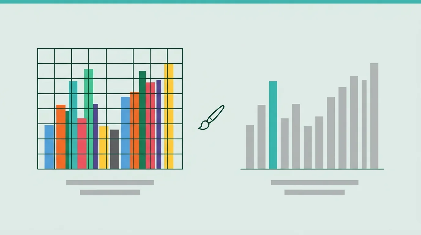
A professional Excel chart is one where the reader gets the point before they read the axis. Pick the chart type from the comparison you are making, then fix eight things on the default: write a title that states the finding, replace the legend with direct labels, use one highlight colour and grey for everything else, lighten or delete the gridlines, start bar axes at zero, label only the values that matter, sort the categories, and add a source line. Every one of those is a control in the Format pane or the chart elements menu. Do it once, save the result as a chart template, and every chart after that starts finished.
Excel's default chart is not bad. It is neutral, and neutral means it treats every series, every gridline and every label as equally important. That is the right starting point for a tool that cannot know what you are trying to say. It is the wrong finishing point for a chart someone else will read in a meeting.
This guide does for charts what Excel table design best practices does for tables: state what the chart owes its reader, then map each rule to the exact control that applies it. The paths below were checked against Microsoft's current documentation for Windows and Mac, with notes where Excel for the web differs.
What's wrong with Excel's default chart?
Insert a clustered column chart from a small table of monthly revenue by region and you get something like this: a title that says "Chart Title" or repeats the column header, a legend at the bottom that forces the reader's eye to shuttle between colour swatches and bars, a different theme colour for every series, horizontal gridlines at every major unit, and an axis Excel sized automatically.
None of those is an error. Each one is a decision Excel made because you had not made it yet. The work of making a chart look professional is taking those decisions back, one at a time. Here is the teardown, scored on eight fixes. Give the default a point for each fix it already passes. Most defaults score one or two. Aim for eight.
| # | Fix | What the reader gets | Where the control lives (Windows) |
|---|---|---|---|
| 1 | Title states the finding | The point, before any decoding | Click the title and type over it; format via right-click, Format Chart Title |
| 2 | Direct labels replace the legend | No eye shuttling to a key | Add Chart Element (plus button beside the chart), Legend, off; then right-click a label, Format Data Labels, Label Options, tick Series Name |
| 3 | One highlight colour, grey for the rest | One place to look | Right-click the series, Format Data Series, Fill; click a single bar again to select just that point |
| 4 | Gridlines lightened or removed | Less ink competing with data | Click a gridline and press Delete, or right-click, Format Gridlines, pale line colour |
| 5 | Axis bounds set on purpose | Honest bar lengths | Right-click the value axis, Format Axis, Axis Options, Bounds, Minimum |
| 6 | Labels only where they earn it | Exact numbers without a wall of text | Add Chart Element, Data Labels, arrow for position; delete individual labels you do not need |
| 7 | Categories sorted | Ranking visible at a glance | Sort the source table; on a bar chart, Format Axis, Categories in reverse order |
| 8 | Source line under the chart | Trust, and somewhere to check | A text box inside the chart area, or a cell directly below it |
On a Mac the same panes exist. Microsoft's documentation routes the element menu through the Chart Design tab, then Add Chart Element, and you reach Format Data Labels or Format Axis with a Control-click or right-click on the element. In Excel for the web, formatting happens in the Chart Format task pane rather than the desktop Format pane, and the options are a smaller set.
The rest of this guide explains why each fix matters, so you can make the call when a chart does not fit the rubric.
Which chart fits which comparison?
Formatting cannot rescue the wrong chart type. Before you touch a colour, name the comparison you are making. Almost every business chart is one of five.
- Ranking (which region sold most): a horizontal bar chart, sorted. Bars read more easily than columns when category names are long, because the names sit horizontally instead of tilting.
- Change over time (revenue by month): a line chart. Columns work for a handful of periods, but a line shows the shape of a trend and handles thirty-six months without turning into a picket fence.
- Part of a whole (share of spend by department): a single stacked bar or a sorted bar chart of percentages. A pie works only with a few slices of clearly different sizes, because people compare angles far worse than lengths.
- Distribution (how order values spread): a histogram. Averages hide shape; a histogram shows it.
- Relationship (does ad spend track with signups): a scatter chart, one dot per observation.
Two chart families to avoid for business reporting: 3D charts and dual-axis charts. A 3D column adds a perspective that makes bars at the back look shorter than bars at the front, and it tells the reader nothing the flat version does not. Microsoft's own guidance on web-ready charts also lists 3-D effects such as bevels and lighting among the formatting that does not carry over cleanly to Excel for the web. Dual axes invite the reader to compare two lines whose relative position is set entirely by where you placed the two scales. If you need two measures, use two small charts side by side.
Why should the title state the finding?
"Revenue by Region, Q3" describes what the chart contains. "North grew fastest in Q3; West fell for the second quarter" tells the reader what to see. The second version is longer and it is much faster, because the reader checks your claim against the bars instead of forming their own and wondering if it matches yours.
A finding title also disciplines the chart. If you cannot write one sentence about what the chart shows, the chart is probably showing too much, or you have not decided what matters yet. Both are worth knowing before you send it.
Practical rules:
- Keep it to one line where possible, two at most. Put the scope (period, unit, region) in a smaller subtitle line or the axis title rather than cramming it into the headline.
- Left-align it with the chart's left edge if your house style allows. People read from the top left.
- Write it last. The finding is sometimes different from the one you expected when you built the chart.
To edit, click the title once to select it and again to place the cursor, then type. The font size, weight and colour live in the right-click Format Chart Title pane and on the Home tab.
Why do direct labels beat the legend?
A legend is a lookup table. The reader sees a blue bar, looks down to the legend, finds blue, reads "North", looks back up, and has now lost which bar they were on. With four series that happens dozens of times per chart.
Direct labels put the series name at the end of each line or beside the last bar, so the lookup never happens. On a line chart, select the last point of each series, add a data label, and in Format Data Labels under Label Options tick Series Name and untick Value. Then remove the legend through Add Chart Element, Legend, None. On Windows the add element menu is the plus-sign button that appears beside the selected chart; on a Mac it sits on the Chart Design tab.
If you have a single series, the legend is pure overhead. Delete it and let the title name the measure.
When must a bar axis start at zero, and when can a line axis skip it?
A bar or column encodes its value as length. If the axis starts at 90 instead of 0, a bar for 100 is twice as tall as a bar for 95, and the reader's eye reports a doubling that the data does not contain. For bars and columns, the value axis starts at zero. No exceptions worth making.
A line encodes its value as position and slope. The reader is judging the direction and rate of change, not the distance from the floor. A line chart of a price that moves between 142 and 158 is unreadable on a zero-based axis: the whole story becomes a flat line near the top. For lines, set the bounds to the range where the change is visible, and make sure the axis labels are clear enough that nobody mistakes the scale.
Excel picks the bounds for you when it creates a chart, and it does not know which of these rules applies. To set them, right-click the value axis, choose Format Axis, and under Axis Options type into the Minimum and Maximum boxes of Bounds; Reset puts Excel's automatic value back. The same pane holds Display units, which shows 1,200,000 as 1.2 with a "Millions" label, and Major unit, which sets the gridline interval. Microsoft documents every option in changing the scale of the vertical (value) axis, including the Mac variations.
For the number format on the axis itself (thousands separators, currency, scaled units), use the Number section of the same pane. The format grammar is identical to cells, and our Excel number formatting guide covers it in full.
How many colours does a chart need?
Usually two: one colour for the thing you want the reader to look at and one neutral grey for everything else. That is the single biggest difference between a default chart and one that looks designed.
Excel's default gives every series its own theme colour, which says "all of these are equally important". They rarely are. If the chart is about North, make North your accent colour and every other region a mid grey. If it is about one month that broke the trend, grey all the columns and colour that one. To colour a single column, click the series once to select all of it, then click the one column again to select only that point, and set its fill in Format Data Point.
Choose the accent from the same palette as the tables around it. Our Excel colour palette guide gives six-value palettes with hex codes that already pass contrast checks, and the accent slot in any of them works as a chart highlight. Two more rules:
- Never make colour the only way to tell series apart. Direct labels already solve this, which is another reason to use them. The spreadsheet accessibility checklist covers colour contrast and alt text for charts.
- Keep gridlines and axis lines in a light grey, or delete them. Chart gridlines exist to help the eye estimate a value; once you have data labels on the bars that matter, most of them are redundant.
Gap width is the other quick win for column and bar charts. Right-click the series, choose Format Data Series, and under Series Options lower Gap Width so the bars are wider than the spaces between them. Thin bars with wide gaps read as sparse and hesitant.
How do you handle sort order and the source line?
Sort a ranking chart by value, largest first. Excel plots categories in the order they appear in the source table, so the fastest fix is to sort the table itself. On a horizontal bar chart there is a catch: Excel draws the first category at the bottom, so a table sorted largest first produces a chart with the largest bar at the bottom. Fix it with Format Axis on the category axis, Axis Options, Categories in reverse order, and if the value axis jumps to the top, set where the horizontal axis crosses to the maximum category in the same pane. Time series are the exception: keep them chronological, oldest on the left.
A source line is a short line of small grey text under the chart: where the data came from and when it was pulled. "Source: CRM export, 30 Sep 2026." It costs nothing and it answers the first question a sceptical reader asks. Add it as a text box inside the chart area so it moves and copies with the chart.
How do you save your formatting as a reusable chart template?
Doing eight fixes on every chart is what makes people give up and ship the default. Do them once and save the result.
Right-click the finished chart and choose Save as Template. Give it a name and save; Excel stores it as a .crtx file in its chart templates folder. To use it on a new chart, select your data and choose the template from the Templates folder in the Insert Chart dialog. To apply it to a chart that already exists, select the chart, then Chart Design, Change Chart Type, Templates. The steps are the same on Windows and Mac, and Microsoft's page on saving a custom chart as a template walks through both.
Two things to know. First, a template stores the colours in use when you saved it, not your workbook's theme colours, so a chart built from it keeps your grey and accent even in a workbook with a different theme. If you ever want the theme colours back, Reset to Match Style does it. Second, the template carries formatting, not content: your finding title and source line still need writing for each chart, which is correct, because every chart has a different finding.
Microsoft documents chart templates for the desktop apps. If most of your work happens in Excel for the web, build and apply templates in the desktop app and do lighter edits in the browser.
Why start with the table behind the chart?
Every chart inherits its problems from its source range. A column of numbers stored as text will not chart as numbers. A header row with a merged cell confuses the series names Excel picks up. A table sorted alphabetically gives you an alphabetical bar chart. Blank rows split one series into fragments, and totals rows left inside the range turn into a bar three times taller than the rest.
That part is where SuperSheet comes in, and only that part. SuperSheet formats tables, not charts: it will not restyle a chart for you. What it does is turn the range your chart reads into a clean, correctly typed table, with real number formats, consistent headers and a frozen header row, so the chart you build from it starts from good data. If your source has numbers stored as text or stray spaces in the headers, the spreadsheet cleaner fixes those first. And if the chart is going onto a one-screen summary, Excel dashboard design covers how many charts fit and where they go.
FAQ
How do I remove chart clutter in Excel?
Work through the elements in order of how much ink they use for how little information: the legend (replace with direct labels or delete if there is one series), gridlines (delete or set to a pale grey), the chart border (set the chart area outline to none in Format Chart Area), redundant axis titles (the finding title and units usually cover them), and data labels on every point (keep only the ones that support the title). Anything you can click, you can delete with the Delete key.
Should I use 3D charts in Excel?
No. A 3D effect distorts bar heights through perspective, hides some bars behind others, and adds nothing a flat chart lacks. Microsoft's web-ready chart guidance also flags 3-D effects among the formatting that does not carry over cleanly to Excel for the web.
How do I make all my Excel charts use the same style?
Format one chart the way you want it, right-click it, and choose Save as Template. Apply the template to new charts from the Templates folder in Insert Chart, and to existing ones through Chart Design, Change Chart Type, Templates. Because the template stores its own colours, charts made from it stay consistent across workbooks with different themes.
Do Excel charts keep their formatting in Google Sheets?
Common chart types open and can be edited, but do not assume every detail survives. Google's own guidance on using Excel and Sheets together says to stay in Excel if you rely on rare chart types such as 3D pyramid or pie-of-pie charts. A .crtx chart template is an Excel file that lives in Excel; in Sheets you restyle a chart by double-clicking it and using the Customize tab of the chart editor, where titles, legend, gridlines and series colours live. If a chart matters, open the converted file and check it before you share the link.
Start with the table behind the chart. Format it free, then build the chart from clean, correctly typed columns. Nothing is uploaded, and the download is a real .xlsx.